We have a new Excel Challenge folks!
I know our friends in US are away celebrating Memorial Day weekend. But that should not leave rest of us from fun. So, we have a new Excel Challenge. This time, you need to make a chart, to visualize product sales data.
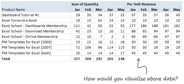
The data you need to use:
Is this,
Download Excel File with this data.
The Instructions:
1) Make one chart (you can make panel charts too, but not a dashboard or multiple charts) to visualize the product sales breakup in our data. Your chart should help answer any of these questions:
- What is the overall composition of revenue, how it is changing over time?
- Which products bring in more $s?
- Trend of sales from Jan to May
2) You are free to make charts that answer additional questions. Just think like a owner of a company that sells these products (think like me, because these are the sales of some of our products) and try to make sense of the data.
3) You can use Excel or Tableau or your favorite visualization tool to make this chart.
How to submit your work?
- Prepare your chart and save the workbook
- Send an email to chandoo.d @ gmail.com with the subject “EC 2 – Solution”
- Or upload your work to skydrive.com, share it with public and post the URL here thru comments.
Note: Submit your work by 6th June , 2011This contest is closed now.
What do you get?
I will post a collection of all your entries on Chandoo.org for our readers to see. I will also pick one random winner from the best charts.
The random winner will receive an Amazon Kindle Reading Device – Wi-Fi Version

Fine Print
Note: Submit your work by 6th June , 2011This Contest is closed now.- You can submit multiple entries
- Or upload your work to skydrive.com, share it with public and post the URL here thru comments.
- Email your workbook to chandoo.d @ gmail.com with the subject “EC 2 – Solution”
- Please do not use add-ins or macros to generate the charts.
- Please send unlocked files only. You also agree that Chandoo.org can publish your files for other to learn.
So go ahead and visualize the product sales data. Enjoy!
Previous Visualization Challenges
Charting is one of my favorite areas. Charts are very good for discovering patterns and communicating. We run contests on charting all the time. Browse some of our previous contests,
- How do you visualize world education rankings data?
- Sales Dashboards to analyze sales data – 32 variations
- Visualizing Budget vs. Actual Numbers – 14 options
- More Charting Tutorials
Generated by BlogIt
BlogIt - Auto Blogging Software for YOU!


No comments:
Post a Comment